Pranahanna logo
The logo for a Kundalini yoga instructor, blending both personal and spiritual elements. The goal was to create a deeply personal design that is not only meaningful to the instructor but also embodies the essence of Kundalini yoga: calming, growth-focused, and deeply connected to nature.
At the heart of the logo is a “PH” monogram, with subtle references to Hanna’s profile. The design incorporates leaves, symbolizing nature and the growth that comes with yoga practice.
The color palette is a calming mix of sea foam green and light water mint, paired with earthy secondary tones like natural gray, skin ivory and pure white. These colors evoke a sense of tranquility and balance, mirroring the peaceful and transformative nature of the yoga practice.

The text “Pranahanna” has a slight Sanskrit-inspired style, reflecting the spiritual roots of Kundalini yoga.

A mix of sea foam green and water mint creates an intriguing interplay of contrasts: calming in nature, yet subtly exciting. This unique color palette captures the essence of balance and harmony, perfectly reflecting the spirit of Pranahanna.
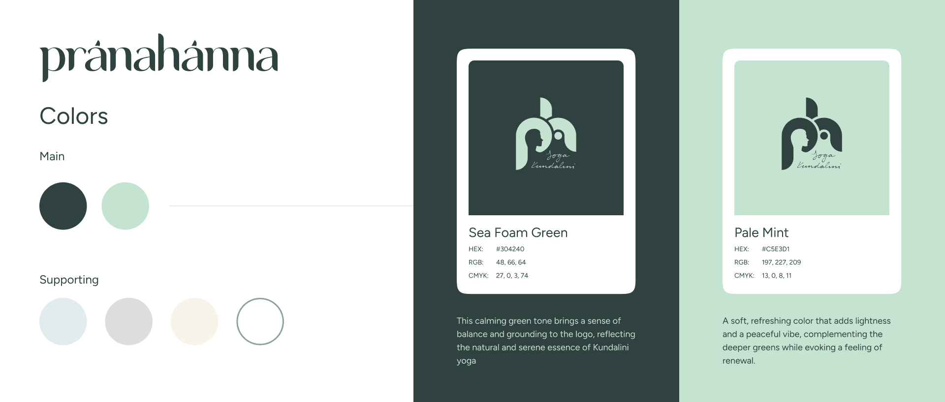
The colors are perfectly balanced, allowing for seamless inverted usage while maintaining their calming and harmonious essence.
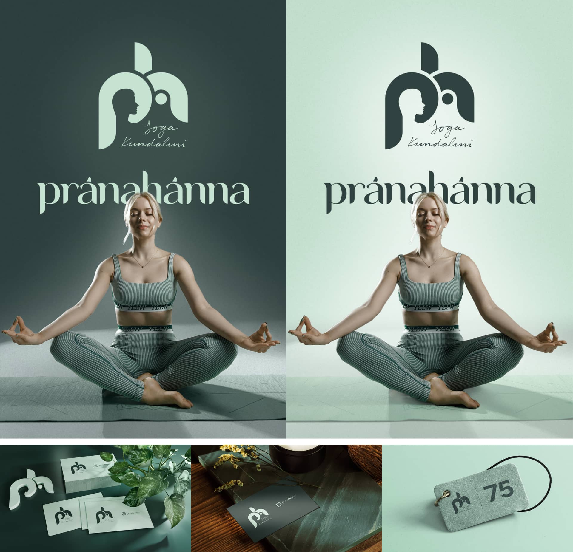
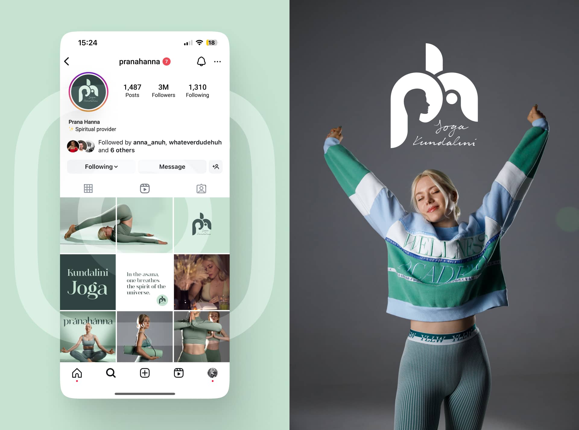
Brand theme is thoughtfully designed to be consistent across all media, from yoga gear to Instagram reels.
Thanks for scrolling. Meditate over my other branding works or let me design your life story.